Plot DSL
Plots are declared in fenced plot code blocks:
```plot
LINE_CHART(x=timestamp, y=duration_ms)
  ON recent_pauses
  TITLE "Recent GC pauses"
  AXIS_Y LABEL "ms" TYPE LOG
```
A plot expression consists of:
- A plot type with inner arguments in parentheses.
- Zero or more tail clauses.
- Optionally combined with other plots using composite operators.
Plot types
| Canonical | Aliases | Renders |
|---|---|---|
LINE_CHART |
LINE |
Line chart with one series per color group. |
BAR_CHART |
BAR |
Vertical bar chart. |
SCATTER_PLOT |
SCATTER |
Scatter plot with optional size and color. |
HEATMAP |
HEAT |
2D binned heatmap with x, y, and value (intensity). |
HISTOGRAM |
HIST |
Frequency histogram over x. Supports bins (count) and logBins: true for log-scale bucketing. |
BOX_PLOT |
BOX |
Box-and-whisker per x category. |
PIE_CHART |
PIE |
Pie chart with category and value columns. |
FLAMEGRAPH |
FLAME |
Flamegraph of stack frames — frames (frame list column) and value (weight column). |
TABLE |
— | Rendered results table. |
AREA_CHART |
AREA |
Stacked / overlaid filled areas. |
GANTT |
— | Gantt bars with start, end, and lane (row category). Optional task (bar label). |
RANGE |
— | Range/interval band with x, low, high. Optional center line and color. |
TREEMAP |
TREE |
Hierarchical treemap with path (one or more columns) and value (numeric weight). |
WATERFALL |
FALL |
Waterfall/bridge chart with category and value; positive segments go up, negative down. |
VIOLIN_PLOT |
— | Kernel-density distribution shape with optional category split and configurable bins. |
SUNBURST |
— | Sunburst drill-down chart with path (one or more columns, or a delimited single column) and value. |
SANKEY |
— | Sankey flow diagram with source, target, and value columns. |
CROSSTAB |
— | Pivot table with heat-map cell coloring. Aggregates value by two categorical dimensions (row / col). |
BIG_NUMBER |
— | Large stat card showing a single scalar value with optional label and comparison delta. |
Aliases are accepted anywhere the canonical name is. LINE(x=t, y=v) is equivalent to LINE_CHART(x=t, y=v).
PIE_CHART also accepts the older names name / labels / values for backwards compatibility; prefer category / value.
LINE_CHART
Lines over time — ideal for CPU, memory, GC activity, or any metric that changes continuously. Supports zoom, pan, dual Y-axis, and reference lines.
Example 1 — A simple time-series chart showing total CPU usage
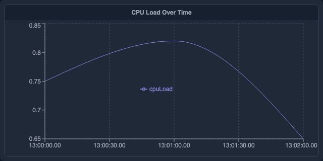
```plot
LINE_CHART(x: "timestamp", y: ["cpuLoad"])
  TITLE "CPU Load Over Time"
  AXIS_Y LABEL "CPU Load" DOMAIN [0, 1]
```
Example 2 — An interactively zoomable chart linked to global variables
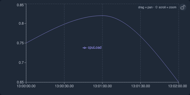
```plot
LINE_CHART(x: "timestamp", y: ["heapUsed"])
  TITLE "Heap Used (Zoomable)"
  LINK_X($start, $end)
  AXIS_Y LABEL "Bytes"
```
Example 3 — Dot/points style (no connecting line)
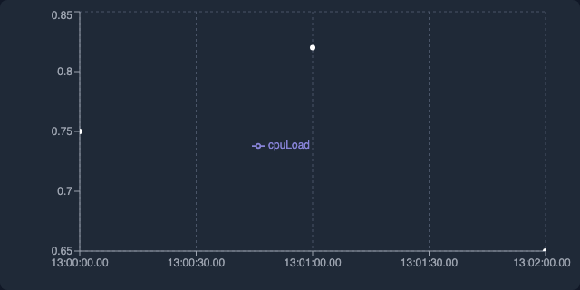
```plot
LINE_CHART(x: "timestamp", y: ["callCount"], lineType: "dots")
  TITLE "Method Call Frequency"
```
Example 4 — Multi-series comparing CPU metrics
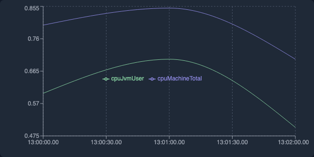
```plot
LINE_CHART(x: "timestamp", y: ["totalCpu", "jvmCpu"])
  TITLE "Total CPU vs JVM User CPU"
  AXIS_Y LABEL "CPU Load" DOMAIN [0, 1]
```
Example 5 — Allocation rate with threshold reference line
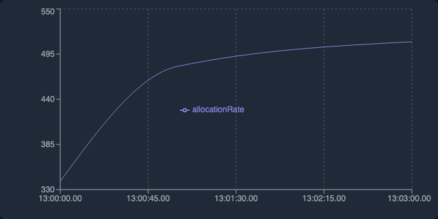
```plot
LINE_CHART(x: "timestamp", y: ["allocRate"], connectNulls: true)
  TITLE "Allocation Rate"
  AXIS_Y LABEL "MB/s"
```
Example 6 — Dual Y-axis: heap usage vs. GC throughput
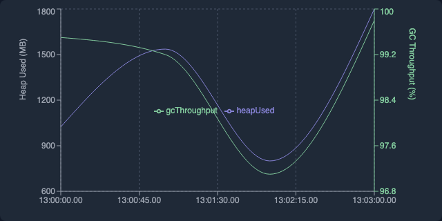
```plot
LINE_CHART(x: "timestamp", y: ["heapUsed"], y2: ["gcThroughput"])
  TITLE "Heap Used vs GC Throughput"
  AXIS_Y LABEL "Bytes"
```
BAR_CHART
Bars for comparing values across categories — e.g. GC causes, top methods, pause counts per thread. Supports grouped, stacked, horizontal, and mixed bar+line.
Example 1 — Simple bar chart by category
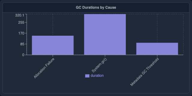
```plot
BAR_CHART(x: "cause", y: ["duration"])
  TITLE "GC Duration by Cause"
  AXIS_Y LABEL "ms"
```
Example 2 — Grouped (side-by-side) bars
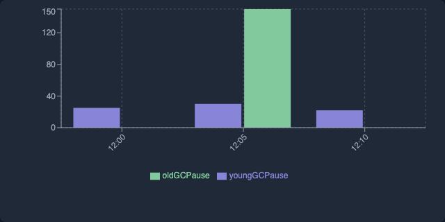
```plot
BAR_CHART(x: "cause", y: ["youngGen", "oldGen"], layout: "grouped")
  TITLE "Young vs Old Gen GC Pauses"
  AXIS_Y LABEL "ms"
```
Example 3 — Stacked bar chart
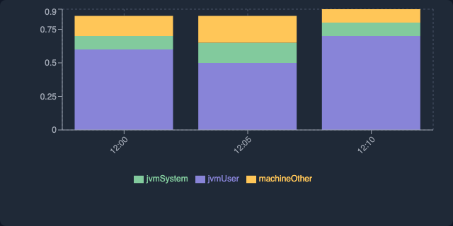
```plot
BAR_CHART(x: "timestamp", y: ["userCpu", "systemCpu", "ioCpu"], layout: "stacked")
  TITLE "CPU Usage Breakdown"
  AXIS_Y LABEL "CPU Fraction"
```
Example 4 — Bar with line overlay
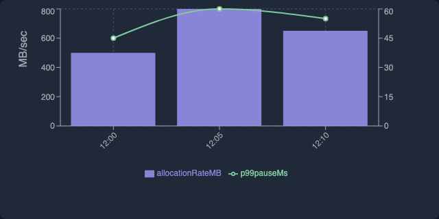
```plot
BAR_CHART(x: "timestamp", y: ["allocRate"], lineY: ["p99Pause"])
  TITLE "Allocation Rate with P99 Pause Line"
```
Example 5 — Horizontal bar chart
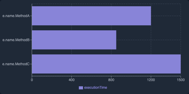
```plot
BAR_CHART(x: "method", y: ["duration"], horizontal: true)
  TITLE "Top Methods by Duration"
  AXIS_Y LABEL "ms"
```
Example 6 — Bar with horizontal reference line
```plot
BAR_CHART(x: "cause", y: ["avg_ms"], yRefLines: [{value: 200, label: "SLA"}])
  TITLE "GC Pause by Cause"
  SORT DESC
  LIMIT 10
```
yRefLines draws horizontal dashed lines at fixed Y values — useful for thresholds, SLA targets, or p99 baselines. Each entry is {value: <number>, label: "<text>"}.
PIE_CHART
Shows how a total breaks down into parts — best for 3–7 categories. Use BAR_CHART if you need precise comparisons.
Example 1 — Thread state breakdown
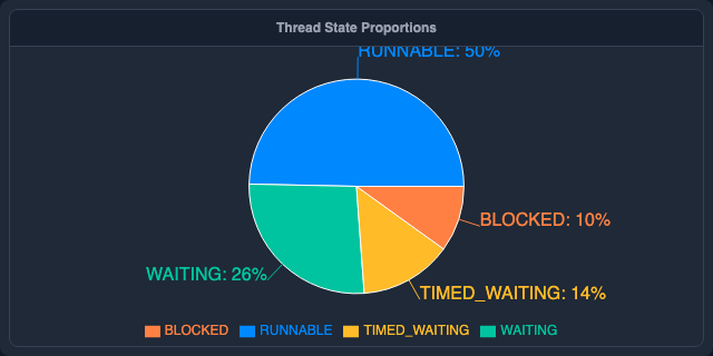
```plot
PIE_CHART(category: "state", value: "count")
  TITLE "Thread State Breakdown"
```
Example 2 — Donut chart with outer labels
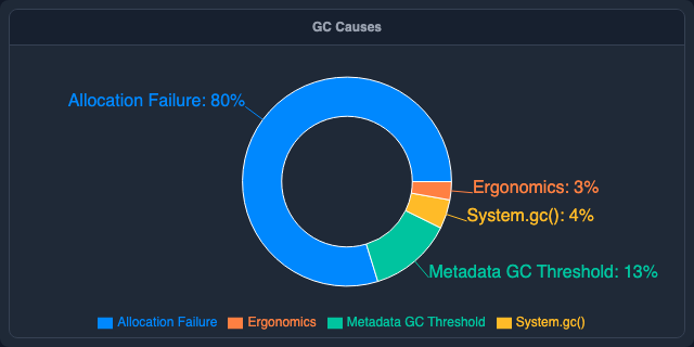
```plot
PIE_CHART(category: "cause", value: "count", innerRadius: 0.5)
  TITLE "GC Cause Breakdown"
```
Example 3 — Memory pool split
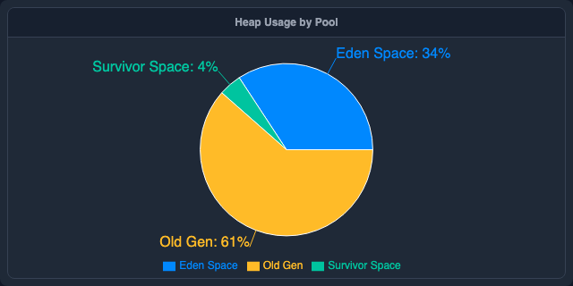
```plot
PIE_CHART(category: "pool", value: "usedMb")
  TITLE "Memory Pool Usage"
```
SCATTER_PLOT
Plots individual data points by two numeric axes — great for spotting correlations (e.g. pause duration vs. bytes reclaimed). Add a third numeric column as size for bubble charts.
Example 1 — Memory reclaimed vs. pause duration
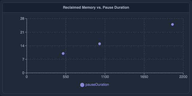
```plot
SCATTER_PLOT(x: "reclaimedMb", y: "duration")
  TITLE "GC Duration vs Memory Reclaimed"
  AXIS_X LABEL "MB Reclaimed"
  AXIS_Y LABEL "ms"
```
Example 2 — Zoomable/pannable scatter
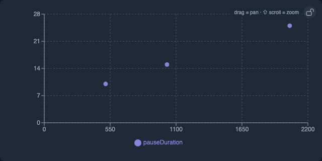
```plot
SCATTER_PLOT(x: "heapUsed", y: "allocRate")
  TITLE "Heap Used vs Allocation Rate"
  LINK_X($zoom_start, $zoom_end)
```
Example 3 — Bubble chart (size + color)
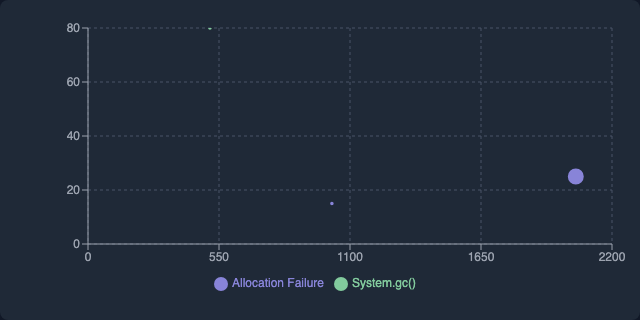
```plot
SCATTER_PLOT(x: "reclaimedMb", y: "duration", size: "youngGenSize", color: "cause")
  TITLE "GC Events by Cause"
```
HEATMAP
Two-dimensional color grid — great for showing intensity across two categorical dimensions (e.g., thread × time, class × method).
Example 1 — Lock contention by thread and lock
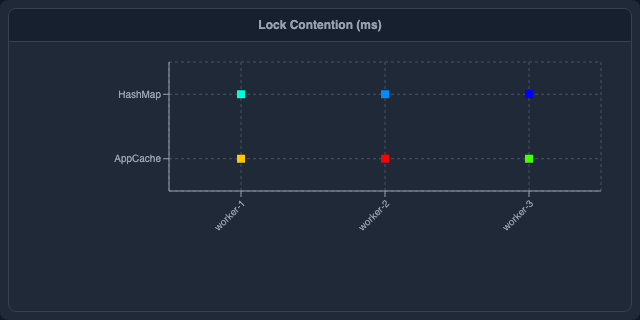
```plot
HEATMAP(x: "lock", y: "thread", value: "waitMs")
  TITLE "Lock Contention (ms)"
```
Example 2 — CPU load by hour and day of week
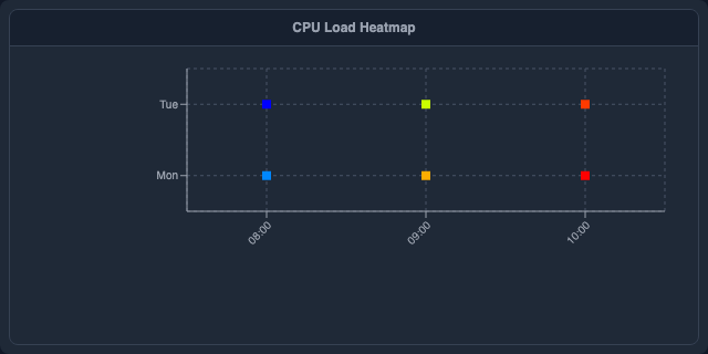
```plot
HEATMAP(x: "hour", y: "dayOfWeek", value: "avgCpu")
  TITLE "CPU Load by Hour and Day"
```
Example 3 — Allocation rate per class and GC phase
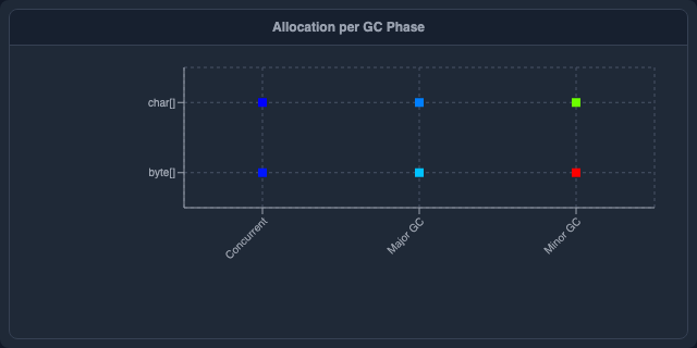
```plot
HEATMAP(x: "gcPhase", y: "className", value: "allocBytes")
  TITLE "Allocation Rate per Class and GC Phase"
```
FLAMEGRAPH
Flamegraph of stack frames — interactive, zoomable. Requires frames (column of frame arrays) and value (weight column such as sample count or duration).
Example 1 — CPU flamegraph
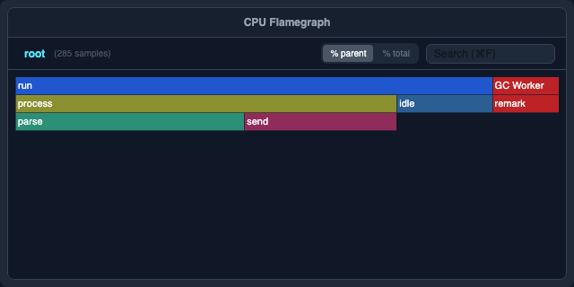
```plot
FLAMEGRAPH(frames: "stackFrames", value: "samples")
  TITLE "CPU Flamegraph"
  HEIGHT 400px
```
HISTOGRAM
Frequency distribution of a single numeric column — shows how values cluster. Use logBins: true for data spanning many orders of magnitude (e.g., pause durations from µs to seconds).
Example 1 — GC pause duration distribution
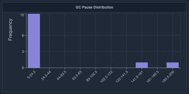
```plot
HISTOGRAM(x: "duration", bins: 10)
  TITLE "GC Pause Distribution"
```
Example 2 — Log-scale bins for allocation sizes
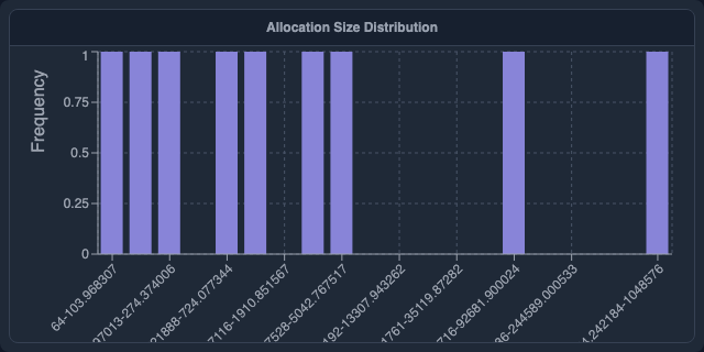
```plot
HISTOGRAM(x: "allocationSize", bins: 20, logBins: true)
  TITLE "Allocation Size Distribution"
```
BOX_PLOT
Distribution summary (min, Q1, median, Q3, max) — good for comparing spread across categories like GC pauses per cause or latency per endpoint.
Example 1 — Single distribution of GC pauses

```plot
BOX_PLOT(value: "duration")
  TITLE "Distribution of GC Pauses"
  AXIS_Y LABEL "ms"
```
Example 2 — Multiple boxes comparing GC types
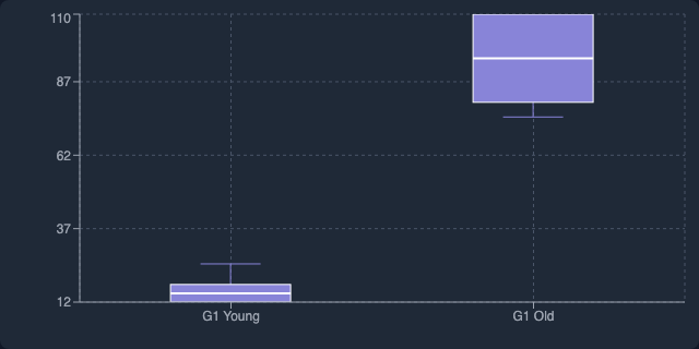
```plot
BOX_PLOT(value: "duration", category: "gcType")
  TITLE "Pause Duration by GC Type"
  AXIS_Y LABEL "ms"
```
AREA_CHART
Filled area chart — ideal for visualizing cumulative or proportional data over time, such as heap usage breakdown or allocation rates. Supports stacked or overlapping areas.
Example 1 — Simple heap area
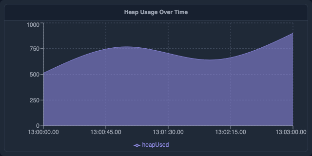
```plot
AREA_CHART(x: "timestamp", y: ["heapUsed"])
  TITLE "Heap Used Over Time"
  AXIS_Y LABEL "MB"
```
Example 2 — Stacked memory regions
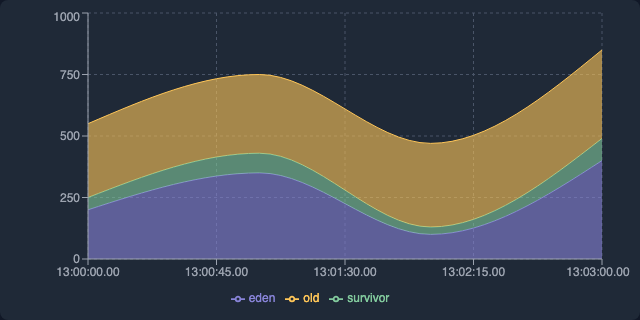
```plot
AREA_CHART(x: "timestamp", y: ["eden", "survivor", "tenured"], layout: "stacked")
  TITLE "Memory Regions Over Time"
  AXIS_Y LABEL "MB"
```
GANTT
Horizontal Gantt chart showing time ranges per category — ideal for thread activity timelines, GC pause periods, or any start→end interval data.
Example 1 — GC pause intervals per phase
```plot
GANTT(start: "startTime", end: "endTime", lane: "phase")
  TITLE "GC Phase Timeline"
```
Example 2 — Thread activity colored by state
```plot
GANTT(start: "startTime", end: "endTime", lane: "thread", color: "state", task: "phase")
  TITLE "Thread Activity"
```
RANGE
Confidence interval / error band chart — shaded area between a low and high bound with an optional center line. Useful for showing p5–p95 latency bands, GC pause ranges, or CPU confidence intervals.
Example 1 — P5–P95 GC pause latency band
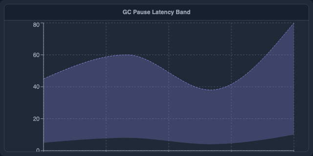
```plot
RANGE(x: "timestamp", low: "p5", high: "p95")
  TITLE "GC Pause Latency Band (P5–P95)"
  AXIS_Y LABEL "ms"
```
Example 2 — CPU usage spread with median center line
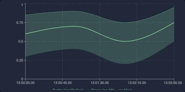
```plot
RANGE(x: "timestamp", low: "minCpu", high: "maxCpu", center: "medianCpu")
  TITLE "CPU Usage Spread"
  AXIS_Y LABEL "CPU Load"
```
TREEMAP
Hierarchical area chart where each rectangle's area is proportional to its value. Use a list of columns as the path to build multi-level hierarchies (e.g., package → class), or use a single delimiter-separated column.
Example 1 — Package-level memory allocation
```plot
TREEMAP(path: ["package", "className"], value: "allocBytes")
  TITLE "Allocation by Package and Class"
```
Example 2 — Single-column slash-delimited path
```plot
TREEMAP(path: "fullClassName", value: "samples", delimiter: "/")
  TITLE "CPU Samples by Class"
```
WATERFALL
Waterfall (bridge) chart — each bar starts where the previous one ended. Positive values go up, negative values go down. Ideal for showing cumulative effects (e.g., memory deltas, GC reclaim/overhead breakdown).
Example 1 — GC memory delta breakdown
```plot
WATERFALL(category: "phase", value: "deltaBytes")
  TITLE "GC Memory Deltas"
  AXIS_Y LABEL "Bytes"
```
VIOLIN_PLOT
Kernel-density estimate of a numeric distribution — wider sections show where data is more concentrated. Optional category column draws one violin per group side by side.
Example 1 — GC pause duration distribution
```plot
VIOLIN_PLOT(value: "pauseMs")
  TITLE "GC Pause Distribution"
  AXIS_Y LABEL "ms"
```
Example 2 — Pause duration split by GC type
```plot
VIOLIN_PLOT(value: "pauseMs", category: "gcType", bins: 30)
  TITLE "Pause Duration by GC Type"
  AXIS_Y LABEL "ms"
```
Supports BRUSH $var to write $var.selection = the category label on click.
SUNBURST
Interactive sunburst drill-down chart. Clicking an inner arc zooms in; the breadcrumb trail lets you navigate back. Use a list of columns as the path to describe hierarchy levels, or a single string column with a delimiter separator.
Example 1 — Package → class hierarchy
```plot
SUNBURST(path: ["package", "className"], value: "samples")
  TITLE "CPU Samples"
```
Example 2 — Slash-delimited call path
```plot
SUNBURST(path: "callPath", value: "samples", delimiter: "/")
  TITLE "Hot Paths"
```
Supports BRUSH $var to write $var.selection = the node name on click.
SANKEY
Sankey flow diagram showing how a quantity flows from source nodes through target nodes. Clicking a node focuses the chart on that node and its immediate neighbours; click again to reset.
Example 1 — Method call flow
```plot
SANKEY(source: "caller", target: "callee", value: "samples")
  TITLE "Hot Call Paths"
```
Example 2 — Thread-to-lock allocation flow
```plot
SANKEY(source: "thread", target: "lock", value: "waitMs")
  TITLE "Thread → Lock Wait Time"
```
Supports BRUSH $var to write $var.selection = the node name on click.
CROSSTAB
Pivot table with per-cell heat-map coloring (blue intensity = relative magnitude). Aggregates a numeric value column by two categorical dimensions: row and col. The agg parameter selects the aggregation function (SUM, AVG, COUNT, MAX, MIN; default SUM).
Example 1 — GC pause by cause and phase (average)
```plot
CROSSTAB(row: "cause", col: "phase", value: "pauseMs", agg: "AVG")
  TITLE "Avg Pause by Cause and Phase"
```
Example 2 — Thread × lock contention count
```plot
CROSSTAB(row: "thread", col: "lock", value: "samples", agg: "COUNT")
  TITLE "Contention Count"
```
Supports two-variable BRUSH $rowVar $colVar to write $rowVar.selection = row label and $colVar.selection = column label on cell click.
TABLE
Sortable, filterable table with CSV export — the default when no other plot is specified. Timestamps, durations, and numbers are auto-formatted.
Example 1 — Default table (auto-detected columns)

```plot
TABLE()
  TITLE "Query Results"
```
Example 2 — Selected columns with custom widths
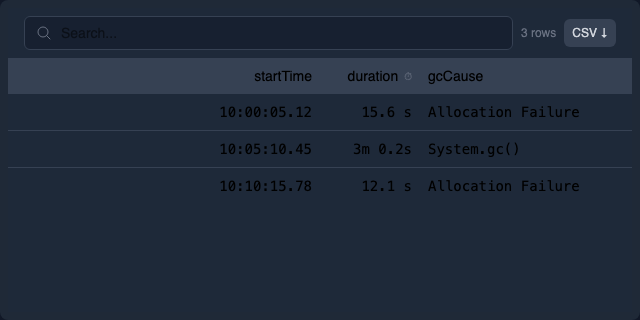
```plot
TABLE(headers: ["timestamp", "cause", "duration"], columnWidths: [200, 150, -1])
  TITLE "GC Events"
```
BIG_NUMBER
Renders a single metric as a large prominent number — ideal for KPI-style summary cells. Optionally shows a label beneath the number and a delta (change vs. a baseline) with colour coding.
Example 1 — Simple scalar
```sql
-- alias avg_pause
SELECT AVG(duration_ms) AS avg_ms FROM gc
```
```plot
BIG_NUMBER(value: "avg_ms")
  TITLE "Average GC Pause"
```
Example 2 — With label and delta
```sql
-- alias summary
SELECT
  count(*) AS pauses,
  count(*) - $$baseline_count AS delta
FROM gc
```
```plot
BIG_NUMBER(value: "pauses", label: "Total GC Pauses", previousValue: "delta")
  ON summary
  TITLE "Pause Count"
```
Inner arguments:
| Argument | Type | Description |
|---|---|---|
value |
column | Column whose value is displayed as the large number. Required. |
label |
string | Descriptive text shown below the number. |
previousValue |
column | Column whose value is shown as a ±change badge (% delta from this value to value). Positive = red, negative = green. |
format |
string | d3-format string for the main value (e.g. ".1f", ",.0f"). |
Inner arguments
Inner arguments go inside the parentheses after the plot type. All are optional; the sensible defaults for each plot type apply when omitted.
| Argument | Applies to | Meaning |
|---|---|---|
x |
most types | Column bound to the X axis. |
y |
most types | Column bound to the Y axis. May be a list [a, b, c] for multi-series plots. |
value |
HEATMAP, FLAMEGRAPH, TREEMAP, SUNBURST, SANKEY, WATERFALL, CROSSTAB, VIOLIN_PLOT | Intensity / weight column. |
category |
PIE_CHART, BOX_PLOT, WATERFALL, VIOLIN_PLOT | Column providing slice/group labels. |
label |
TABLE, BAR | Text label column. |
start |
GANTT | Column for the bar start time/value. |
end |
GANTT | Column for the bar end time/value. |
lane |
GANTT | Column for the row category on the Y axis. |
task |
GANTT | Optional text drawn inside each bar. |
low |
RANGE | Lower bound column for the shaded band. |
high |
RANGE | Upper bound column for the shaded band. |
center |
RANGE | Optional center-line column (e.g. median). |
frames |
FLAMEGRAPH | Column containing the list of stack frames. |
path |
TREEMAP, SUNBURST | One or more columns describing the hierarchy path, or a single delimiter-separated column. |
delimiter |
TREEMAP, SUNBURST | Separator character for splitting a single path column (default /). |
row |
CROSSTAB | Column for row labels. |
col |
CROSSTAB | Column for column headers. |
agg |
CROSSTAB | Aggregation function: SUM (default), AVG, COUNT, MAX, MIN. |
source |
SANKEY | Source node column. |
target |
SANKEY | Target node column. |
bins |
VIOLIN_PLOT, HISTOGRAM | Number of density/frequency bins (default 20). |
color |
most types | Column used to derive series/category colours. |
size |
SCATTER | Column used to derive marker size. |
trendline |
SCATTER_PLOT | true to draw a linear regression trendline over the scatter points. |
lineType |
LINE_CHART | Render style: "line" (default), "dots", "step", "stepBefore", "stepAfter". |
y2 |
LINE_CHART, AREA_CHART | Columns to plot on a second Y-axis (right side). |
label |
SCATTER_PLOT | Column whose value is rendered as a text label next to each point. |
value |
BIG_NUMBER | Column (or literal) to display as the large number. |
yRefLines |
BAR_CHART, LINE_CHART | Horizontal reference lines at fixed Y values. Each entry: {value: <number>, label: "<text>"}. |
xRefLines |
BAR_CHART, LINE_CHART | Vertical reference lines at fixed X values. Each entry: {value: <number>, label: "<text>"}. |
title |
any | Inline title. Equivalent to the TITLE tail clause. |
Values are column names from the bound query. String literals are wrapped in double quotes.
Tail clauses
Tail clauses come after the closing paren of the plot type and each other, in any order (unless noted).
Titles and layout
TITLE "text"— chart title. Overrides thetitle=inner argument if both are given.WIDTH size— CSS width (400px,50%,100%).HEIGHT size— CSS height.ZOOM factor— uniform CSS scale factor within the current grid cell (e.g.ZOOM 1.5). Note: scroll-zoom interaction (Shift+scroll) is always available on line/area/scatter charts when an x-column is present — it does not require this clause.ZOOM_X factor— scale only the X axis (stretches the chart horizontally).
Data source
ON query_ref[, query_ref, ...]— bind the plot to one or more queries. See "Query references" below. Default: the query immediately preceding the plot block.DATASET name— use a named view as data source. Equivalent toON namefor view-backed data.
Sorting and limiting
SORT ASC— sort bars/rows by value ascending (lowest first) before rendering.SORT DESC— sort bars/rows by value descending (highest first) — useful for top-N charts.LIMIT n— cap the rendered rows/bars to the firstnentries (after anySORT). Applies toBAR_CHARTandTABLE.
Example — top-10 slowest GC causes:
BAR_CHART(x: "cause", y: ["avg_ms"])
  SORT DESC
  LIMIT 10
Legend
LEGEND HIDDEN— hide the legend.LEGEND AT RIGHT | LEFT | TOP | BOTTOM | NONE— legend position.NONEis equivalent toHIDDEN.
Palette
PALETTE "name"— colour palette name. Built-in palettes:category10(D3 default),tableau10,pastel1,dark2,set2.
Linking / brushing
LINK_X($start, $end, [master], [clamp])— link the X zoom range to variables$startand$end. Optionalmastermarks this plot as the driver. Optionalclampprevents zooming beyond the data domain.LINK_Y($var)— link Y axis zoom to a variable.LINK_XY($var)— link both X and Y axes to the same variable (useful for scatter zoom sync).LINK_SCROLL "group"— synchronise horizontal scroll position with all other plots in the same named group.BRUSH $var MODE X | Y | XY— capture user brush selection into$var.$var.brush.lo/$var.brush.hihold the range for X/Y;$var.brush.x_lo/$var.brush.x_hi/$var.brush.y_lo/$var.brush.y_hifor XY.BRUSH $rowVar $colVar— two-variable form for CROSSTAB: writes the clicked row label to$rowVar.selectionand the clicked column label to$colVar.selection.
Interaction gestures for LINK_X charts: drag to pan · Shift+scroll to zoom in/out · Shift+drag to select a range. A reset button appears in the chart corner when zoomed in.
Interaction gestures for BRUSH charts: drag across the chart to set the selection range. Drag with no movement to clear the selection.
Axes
AXIS_X DOMAIN [min, max]— fixed X domain.AXIS_X LABEL "text"— X axis label.AXIS_X TYPE LINEAR | LOG | TIME | BAND— axis scale type.AXIS_X FORMAT "fmt"— tick format string.AXIS_Y DOMAIN [min, max]— fixed Y domain.AXIS_Y LABEL "text"— Y axis label.AXIS_Y TYPE LINEAR | LOG | TIME | BAND— Y scale type.AXIS_Y FORMAT "fmt"— Y tick format string.
Multiple axis modifiers may be chained on a single AXIS_Y (or AXIS_X) line in any order:
AXIS_Y DOMAIN [0, 100] LABEL "ms" TYPE LOG
AXIS_Y TYPE LOG LABEL "ms (log scale)"
AXIS_Y LABEL "Duration" FORMAT ".2f"
The FORMAT string uses d3-format syntax for numeric axes (e.g. ".2f" = two decimal places, ",.0f" = thousands separator, ".2s" = SI prefix). For TYPE TIME axes, the format string uses HH:mm:ss.SSS tokens.
Tooltips
TOOLTIP COLUMNS [col1, col2, ...]— restrict the default tooltip to only the listed columns.ON HOVER TOOLTIP "format"— custom tooltip format string. Use{columnName}placeholders for any column in the data row, including the X-axis column.
Example:
BAR_CHART(x: "cause", y: ["avg_ms"])
  ON HOVER TOOLTIP "Cause: {cause} — avg: {avg_ms} ms"
  TOOLTIP COLUMNS [cause, avg_ms]
Constants
LET @name = value— declare a plot-local constant. Referenced in inner arguments and other tail clauses as@name.
Composite plots
Plots can be composed:
A + B— overlayBon top ofAwith shared axes. Type-checked: mixing incompatible plot types (e.g.PIE + LINE) is rejected.ROW(A, B, C)— horizontal layout of independent plots.COL(A, B, C)— vertical layout of independent plots.
ROW and COL can be nested to build grids:
ROW(
  COL(A, B),
  C
)
Query references
Inside ON, plots refer to queries by:
- 1-based index —
1,2— the Nth SQL block in the enclosing cell. - Alias name —
my_alias— any SQL block with-- alias my_alias. - Cross-cell —
cell_handle.alias_name— an alias from another cell.
Multiple sources are comma-separated: ON pauses_p50, pauses_p99. Each source becomes a series in a compatible plot type.
Examples
Simple line
```plot
LINE(x=timestamp, y=duration_ms) TITLE "GC pauses"
```
Overlay P50 and P99 from two queries
```sql
-- alias p50
SELECT ts, quantile_cont(duration_ms, 0.5) AS ms FROM gc GROUP BY ts
```
```sql
-- alias p99
SELECT ts, quantile_cont(duration_ms, 0.99) AS ms FROM gc GROUP BY ts
```
```plot
LINE(x=ts, y=ms) ON p50, p99
  AXIS_Y LABEL "ms" TYPE LOG
  LEGEND AT RIGHT
```
Brushable range driving a variable
```plot
LINE(x=timestamp, y=duration_ms)
  BRUSH $range MODE X
  LINK_X($range.brush.lo, $range.brush.hi, master, clamp)
```
Composite grid
```plot
ROW(
  LINE(x=t, y=heap_used) TITLE "Heap",
  COL(
    BAR(x=cause, y=count) TITLE "Causes",
    PIE(label=cause, y=count) TITLE "Share"
  )
)
```
Flamegraph
```plot
FLAMEGRAPH(frames=stack, value=samples)
  HEIGHT 400px
```